.svg)

Most B2B interactive demos are built for desktop, but your buyers are increasingly evaluating on their phones, and a demo that breaks at 375px wide is a deal that never makes it into your pipeline.
More than 60% of global web traffic is mobile (Statista, Q1 2026). Yet the average B2B interactive product demo is still designed for a 15-inch screen, a mouse pointer, and a seated evaluator. When a prospect taps into that demo on their phone, they get a shrunken, unreadable mess. They pinch-zoom twice, give up, and move on. You never see them in your pipeline.
A mobile interactive demo is a simulation of your product that a prospect can tap and navigate in a mobile browser, with no download and no install. It's not an interactive walkthrough or a guided screenshot tour. The difference between a demo that happens to load on mobile and one that's designed for mobile is the difference between a dead link and a pipeline opportunity.
This guide covers how to decide which demos need a mobile experience, how to build them, and the design principles that separate demos people finish from demos people abandon. Whether you're running a SaaS demo program or building your first interactive product demo, the framework applies.
Does this demo need a mobile experience?
Not every demo needs a mobile build. Building one when it doesn't matter wastes time. Skipping one when it does matter loses pipeline. The decision comes down to where the demo lives and who sees it.
Desktop evaluators can open a tab and click around. Mobile buyers face three barriers that desktop evaluators don't:
- The commitment of downloading and installing an app (iOS impression-to-install rates sit around 3.6%, versus 33.7% once someone reaches the listing page)
- Device and OS compatibility uncertainty
- Upfront permission requests before the user has seen any value
An interactive demo sidesteps all three. No download, no permissions, no storage. The prospect taps a link and is inside your product in seconds. That's what makes mobile demos worth the effort when the channel calls for them.
Here's how to decide:
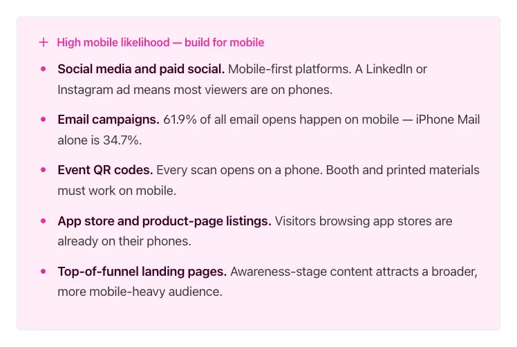
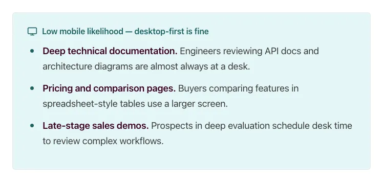
The deciding question: Where does the traffic that reaches this demo originate? If the answer is social, email, or a physical touchpoint, build for mobile. If the answer is a bookmarked docs page or a calendar invite, desktop-first is a reasonable bet.
As one verified G2 reviewer noted: "Buyers increasingly expect self-serve experiences, and Storylane enables us to create interactive environments where they can explore on their own." When those self-serve buyers are on their phones, the demo needs to meet them there.
Check your channel analytics before building. If most of the traffic from that channel is mobile, prioritize a mobile-first design. If mobile is a small minority, a well-formatted desktop demo is probably sufficient. For channels where the split is closer to even, consider the "one demo, both audiences" approach described below.
Three mobile situations and what each needs
Matching your build approach to the right situation means you stop wasting time on full rebuilds when a settings change will do, and stop shipping broken experiences when a dedicated mobile flow was needed. There are three distinct situations, and each calls for a different approach.
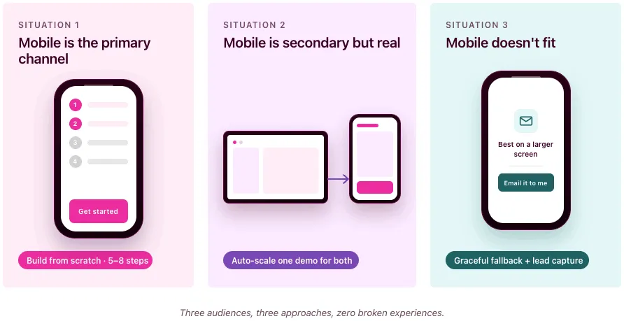
Situation 1: mobile is the primary channel
This applies when the demo's main audience will be on phones: social ads, QR codes at events, app store listings, or SMS campaigns.
What to build: A short, linear, touch-friendly flow designed from scratch for mobile screens. Think 5 to 8 steps maximum, large tap targets, minimal on-screen text, and a single clear CTA at the end. This isn't your desktop demo shrunk down. It's a different experience built for how people interact with their phones.
Situation 2: mobile is secondary but real
This applies when most viewers use desktop, but a meaningful percentage (30 to 50%) will see the demo on a phone. Common scenarios: website embeds, email follow-ups, blog posts.
What to build: A desktop demo that's legible and navigable on a smaller screen. You don't need to rebuild from scratch, but you do need to verify that text is readable without zooming, buttons are tappable, and the flow doesn't break at 375px wide. Storylane's auto-scale and mobile view settings handle much of this, but you should still test on your own phone before publishing.
Situation 3: mobile doesn't fit
This applies when the demo content is inherently desktop-bound: complex dashboards, multi-panel admin interfaces, spreadsheet-like views, or deep configuration workflows.
What to build: Graceful expectation-setting instead of a broken experience. Show a short preview or summary screen on mobile with a message like "This demo is designed for a larger screen. Tap to get it in your inbox." Use that screen as a lead capture form, deliver the full demo by email, and let the prospect view it when they're at their desk. Most interactive demo software supports this kind of conditional routing.
How to build mobile-friendly product demos in Storylane
You can build a fully optimized mobile demo without writing a line of code or involving engineering. Storylane's two primary capture methods, screenshot and HTML, both work for mobile demos. The difference is what you're capturing and which display settings you enable.
Start with the right capture type
Screenshot demos capture images with each click along your recording flow. They're faster to build, support multi-media (images, videos, GIFs), and include zoom and blur for focusing attention or anonymizing data. For mobile, screenshot demos are ideal when you want a quick, guided walkthrough and don't need viewers to interact with live UI elements.
HTML demos capture a responsive, editable HTML/CSS replica of your product UI, including buttons, scrolls, and interactions. You can edit text, data, charts, and graphics directly in the demo, add personalization tokens (like {FirstName}), and blur or delete sensitive data. HTML demos are the better choice for mobile when your web product is already responsive, because the captured HTML naturally adapts to different viewport widths (see Google's responsive web design fundamentals for background on how this works).
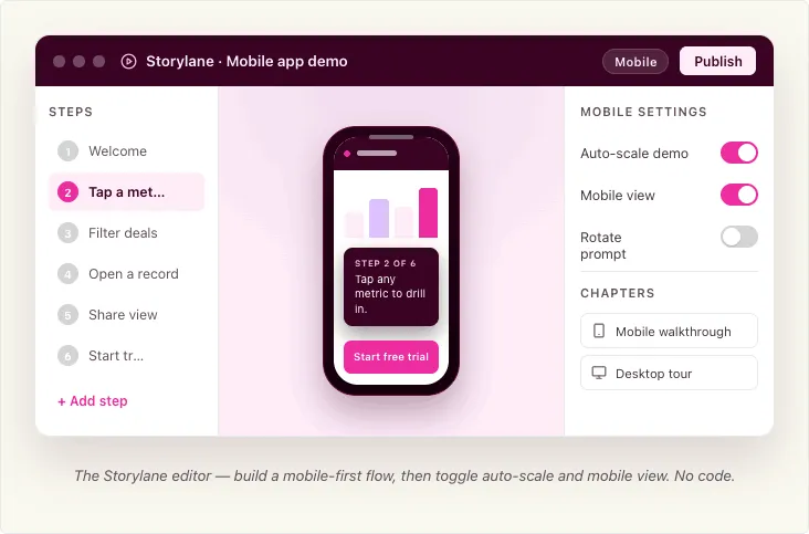
Both types use the Storylane Chrome extension: open your product, launch the extension, select screenshot or HTML, toggle "Add content with AI" if you want auto-generated guides, and click through your flow. Each click captures a step. When you're done, the demo opens in the editor for refinement.
Capturing mobile screens specifically
The capture method depends on what you're demoing.
If your product is a mobile-responsive web app (most common): Resize Chrome's viewport to a mobile width using Chrome DevTools, then capture with the Storylane Chrome extension as you normally would, in either screenshot or HTML mode. This is the fastest path because you don't need a physical device. Your product's own responsive behavior does the work. Most interactive demo software, including Storylane, captures whatever your browser renders.
If your product is a native mobile app (recommended: iPhone Mirroring via Mac app). This captures the real app with full pixel fidelity, so the resulting mobile app demo feels native to the device. Storylane's Mac app lets you mirror your iPhone screen to your Mac and record directly. You capture the real app as it actually runs, with full pixel fidelity. No SDK, no sandbox, no download on the prospect's device.
To use iPhone Mirroring, your Mac needs Apple silicon or a T2 chip running macOS Sequoia 15 or later, and your iPhone needs iOS 18+ with a passcode. Both devices must be on the same Apple ID with two-factor authentication, Bluetooth, and Wi-Fi enabled. The iPhone should be locked and near your Mac. You can also connect via a wired connection if mirroring isn't available (note: iPhone Mirroring is currently unavailable in the EU).
If you're on Windows: Storylane's Windows desktop app lets you record any screen or desktop app, including mobile emulators.
If you're pre-launch or demoing planned features: Storylane's Figma plugin exports your design frames into clickable, interactive demos. Install the plugin, export frames, and create a demo. Make sure all exported frames share the same dimensions. This is useful for testing a mobile experience before writing code.
For quick, lightweight demos: Take screenshots directly from your phone, upload them to Storylane, and build the demo from those images. This works when you need something fast and pixel-perfect interactivity isn't critical.
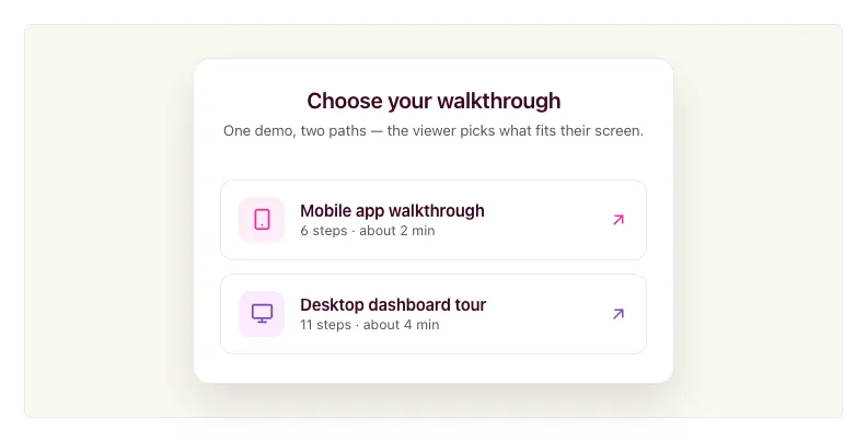
One demo, both audiences
You don't always need separate demos for desktop and mobile viewers. Storylane's Product Tour format lets you combine desktop and mobile captures in a single demo, organized into chapters. When a viewer opens the demo, they see a chapter menu and pick the flow that matches their device or interest. You share one link; the viewer self-selects the right path.
This is useful when you send a single demo link in an email or embed it on a landing page where traffic comes from both desktop and mobile sources. The viewer chooses "Mobile app walkthrough" or "Desktop dashboard tour" from the chapter list, rather than receiving a one-size-fits-all flow.
Making a desktop demo work on mobile
If your demo started as a desktop capture and you need it to display cleanly on phones, Storylane provides three settings in the demo settings panel (the gear icon in the editor).
Screenshot demos: enable Mobile View. This renders the demo correctly on a mobile-sized screen and prompts viewers to rotate their phone to landscape for more horizontal space.
HTML demos: enable Auto-scale Demo. This automatically adjusts the demo to fit the viewer's screen size, so it doesn't overflow or require pinch-zooming. HTML demos can also be responsive, adapting to different viewport widths without manual intervention. Check your Storylane plan settings for availability.
Both types: configure the Small Screen Warning. This setting alerts viewers when their screen is smaller than a width you specify (default is 800px). It's useful for Situation 3 demos where the content genuinely doesn't work on mobile, because you can show a clear message instead of a broken layout. You can adjust the pixel threshold to match your demo's minimum comfortable width.
Embedding and sharing for mobile
Once you've built a mobile-optimized demo, how you share it matters as much as how you built it. Storylane supports inline embeds (the demo auto-starts when the page loads), popup embeds (a CTA button opens the demo full-screen on click), and direct share links. All three work on mobile browsers.
Storylane embeds work on a whole host of tools. For any platform that supports oEmbed (via iFramely or Embedly), you can paste the demo URL and the embed renders automatically.
One detail worth noting for SEO: when copying your embed code, Storylane offers an LLM-Friendly toggle. Turning this on makes your demo content readable by LLMs and search engines, so your product tour can be indexed and discovered organically. Enable it under Share > Embed before copying the code.
Whichever path you choose, always preview the final demo on your own phone before publishing. Desktop preview modes don't catch everything.
Where mobile demos earn their keep
Mobile interactive demos deliver outsized returns in specific use cases where mobile traffic, buyer intent, and evaluation friction intersect. As one verified G2 reviewer put it: "We've seen a noticeable increase in qualified leads since embedding interactive demos on our website and in our outreach." Here's where to prioritize.
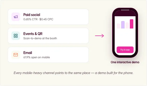
Mobile ad and paid-social landing experiences
Mobile app ad environments deliver a 0.65% CTR at $0.45 CPC, the best cost efficiency in display advertising (Focus Digital, Dec 2025). When you drive that mobile traffic to a static landing page, you waste the engagement. An interactive demo as the landing experience converts that interested tap into a product experience, not a form fill.
Events, field marketing, and QR codes
QR codes are inherently mobile-only touchpoints. A scan-to-demo experience at a trade show booth lets prospects self-serve while your reps focus on high-priority conversations. The prospect walks away having actually used the product, not just picked up a brochure.
Email and sales leave-behinds
With 61.9% of email opens on mobile and 70% of mobile users deleting emails that render poorly on their device (Digital Applied, 2026), an interactive demo link in a follow-up email needs to work on a phone. Storylane makes it easy to share demos via social and email campaigns. When an AE sends a leave-behind after a discovery call, and if the demo breaks on mobile, the deal goes cold between meetings.
One verified Storylane user on G2 described exactly this workflow: "I can send a personalised interactive demo straight after a discovery call, so the product stays front of mind while the champion sells internally on my behalf." Now imagine that champion opens the email on their phone during lunch, taps through the demo, and forwards it to their manager from the same thread. By the next call, two stakeholders have experienced the product, and neither one had to install anything.
Design principles that separate mobile demos people finish from ones they abandon
Building a mobile demo that converts is a design discipline, not just a settings toggle. These five principles make the difference.
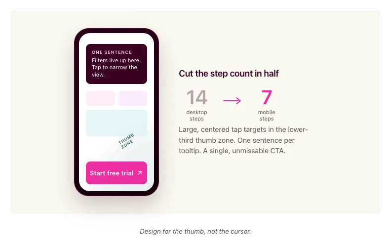
Cut the step count in half
A desktop demo might walk through 12 to 14 steps to show a complete workflow. On mobile, aim for 6 to 8 steps at most. Every unnecessary step is a dropout point. Identify the one or two moments that make your product click for a new evaluator, and build around those.
Ask yourself: if the viewer only completes four steps, will they understand enough to want a full demo? If the answer is no, you have too much setup and not enough payoff.
Write less copy per screen
Mobile screens are small. A tooltip that reads well on desktop becomes a wall of text on a phone. Limit tooltip and annotation text to one sentence or two short lines. Use the demo itself to show what you'd otherwise explain in copy. Let the product's interface carry the story.
Make CTAs thumb-friendly and unmissable
Tap targets on mobile need to be large, centered, and high-contrast. If a CTA button is easy to miss or hard to tap, it doesn't exist. Place your primary CTA where thumbs naturally rest: lower third of the screen, center-aligned. Apple's Human Interface Guidelines cover tap target sizing in detail if you want to go deeper. Avoid placing important buttons near screen edges where accidental taps are common.
Always test on your own phone
Previewing a mobile demo on a desktop browser with responsive mode is not the same as using it on a real phone. The touch targets feel different. The scroll behavior is different. The text size reads differently. Before you publish any mobile demo, pull it up on your actual phone and tap through every step. If anything feels awkward, fix it.
Match the demo to where mobile traffic originates
A demo linked from a paid social ad should be short, visual, and conversion-focused. A demo embedded in a nurture email can be slightly longer and more exploratory because the prospect already has context. A QR code demo at a live event should be fast and self-explanatory because the prospect is standing at a booth. Design the experience to match the context, not just the screen size.
In practice: if your desktop product tour has 14 steps covering five features, your mobile version should focus on the two features that matter most to evaluators at that stage. Build it in 7 steps with one-sentence tooltips and a single "Start your free trial" CTA at the end. Then compare completion rates between the two versions in your analytics. The gap is usually dramatic enough to justify the rebuild.
Measuring what mobile viewers do
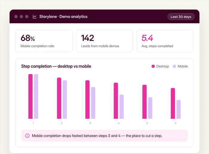
Storylane captures step-level engagement data across both desktop and mobile viewers, so you can see exactly where mobile prospects engage and where they drop off. You can identify which mobile demos drive the most leads, which steps have the highest completion rates, and where the experience breaks down. With CRM integrations into HubSpot and Salesforce, you can tie mobile demo engagement directly to pipeline and attribution, connecting a mobile tap on a QR code demo at a trade show to a closed deal three months later.
FAQ
What's the difference between a mobile demo and an app preview video?
An app preview video is a pre-recorded clip that shows your product. The viewer watches passively. A mobile interactive demo lets the viewer tap, navigate, and explore real product screens at their own pace. The difference is engagement: tapping through a demo is active, and active prospects convert at higher rates because they've already experienced the product firsthand.
Do mobile demos need a download?
No. A mobile interactive demo runs in the prospect's browser. They tap a link, and the demo loads instantly. No app store visit, no install, no storage commitment, no permissions.
Can one demo work on both desktop and mobile?
Yes, with the right approach. Storylane lets you combine desktop and mobile captures in a single Product Tour using chapters. Viewers open the demo and choose the flow that matches their device from a chapter menu. For simpler cases, you can enable auto-scale settings so a desktop demo adapts to a mobile screen. If the desktop and mobile experiences are fundamentally different (like a web dashboard versus a companion mobile app), use chapters so the viewer self-selects. If it's the same product at different sizes, auto-scale works.
How many steps should a mobile demo have?
For a primary-mobile demo (social, QR, app store), aim for 5 to 8 steps. For a desktop demo that also works on mobile, keep it under 12. The key metric is completion rate. Check your Storylane analytics: if mobile viewers are dropping off well before the final step, you probably have too many steps. Trim ruthlessly.
Can I demo a native mobile app without asking users to install anything?
Yes. Storylane's Mac app lets you connect your iPhone via iPhone Mirroring or cable and record your mobile app screens directly from your desktop. The resulting demo is an interactive browser experience. Your prospects never download anything.
Do I need a separate mobile demo for every desktop demo?
No. Start with the demos attached to your highest-mobile-traffic channels (email sequences, social campaigns, event QR codes). Check your analytics to see which demos get significant mobile traffic, and prioritize those. Many desktop demos work acceptably on mobile with auto-scale enabled. Only build a dedicated mobile version when mobile is the primary channel or when the desktop experience genuinely breaks on a small screen.
Start building your first mobile demo
Your buyers are already evaluating on their phones. The question is whether they're seeing a broken desktop shrink-down or an experience you designed for them.
Storylane gives you the tools to capture mobile app screens without downloads, combine desktop and mobile flows in a single demo, and auto-scale existing demos for smaller screens. Over 5,000 sales and marketing teams use Storylane to build demos that move deals forward, backed by a #1 G2 rating and 4.8 stars across 1,400+ reviews.
Sign up and build your first mobile interactive demo.